
Style the collection carousel to match the testimonials carousel (Squarespace 7.1)
I recently built a site for a client that included a Testimonials carousel and a Case Studies carousel, both on the same page. I set up the testimonials using a testimonial section and the case studies as a collection of blog posts. They both work great, but while both of these features are carousels of items with a next and previous button to page through them, for whatever reason, they are styled completely differently.
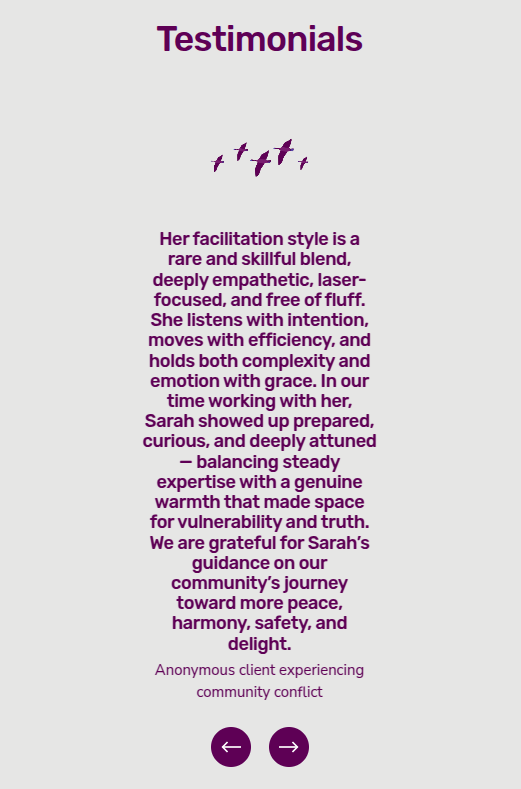
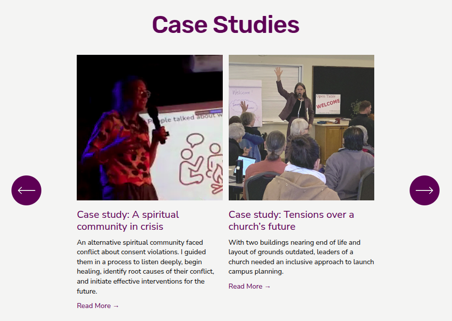
The testimonial carousel has a circular button to either side of the content, with an arrow image in each. The blog collection carousel has small buttons with angle bracket symbols in them, at the top right of the content.

Testimonials carousel

Case studies carousel
In the mobile layout, the testimonial buttons are below the content and smaller, while the collection carousel has the same little angle symbols at the top right of the content.
Testimonials carousel on mobile

Case studies carousel on mobile
I wanted them to have matching styling, so I used CSS to make the collection carousel look like the testimonials one. Since the collection's buttons are before the content in the HTML, I wasn't sure if I would be able to make them appear below the content, but it turned out to be not very hard.
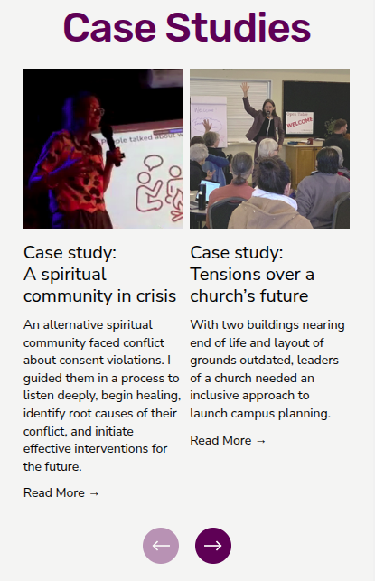
Now it looks like this:
Case studies, after, on desktop
Case studies, after, on mobile
Here is the CSS:
// clear the angle symbols out of the collections carousel buttons (on desktop and mobile)
#block-2f1adc7133de181a2fdb .sqs-gallery-design-carousel .sqs-gallery-controls .previous::before,
#block-2f1adc7133de181a2fdb .sqs-gallery-design-carousel .sqs-gallery-controls .next::before {
  content: "";
}

// desktop layout only
@media only screen and (min-width: 749px) {
  // shrink the content and center it horizontally
  #block-2f1adc7133de181a2fdb .sqs-gallery-container {
    width: 80%;
    margin-left:auto;
    margin-right:auto;
  }

  // make the container of the buttons wide and (about) vertically centered
  #block-2f1adc7133de181a2fdb .summary-block-header {
    position:absolute;
    width: 125%;
    top: 45%;
    left:-12.5%;
    overflow: visible;
  }

  #block-2f1adc7133de181a2fdb .summary-carousel-pager {
    position: absolute;
    float: none;
    display: block;
    width:100%;
    margin-top: auto;
    margin-bottom: auto;
  }

  // position the buttons left and right of the content
  #block-2f1adc7133de181a2fdb .summary-carousel-pager-prev {
    float:left;
    margin-left: 4vw;
  }
  #block-2f1adc7133de181a2fdb .summary-carousel-pager-next {
    margin-right: 4vw;
  }

  // style the buttons
  #block-2f1adc7133de181a2fdb .summary-carousel-pager span {
    width: 60px;
    height: 60px;
    border-radius: 50%;
    opacity: 1;
  }

  // put the arrows in the buttons
  #block-2f1adc7133de181a2fdb .sqs-gallery-design-carousel .sqs-gallery-controls .previous {
    background: no-repeat scroll center center / 36px 36px  url("https://images.squarespace-cdn.com/content/68323e0cafa592299a473a32/12ea19c3-9a59-434a-a1ba-9dd522cbe7ad/carousel-prev-arrow.png?content-type=image%2Fpng") var(--list-section-carousel-arrow-background-color);
  }
  #block-2f1adc7133de181a2fdb .sqs-gallery-design-carousel .sqs-gallery-controls .next {
    background: no-repeat scroll center center / 36px 36px  url("https://images.squarespace-cdn.com/content/68323e0cafa592299a473a32/d6ca0d68-8353-4c44-b5f8-89940bf3a560/carousel-next-arrow.png?content-type=image%2Fpng") var(--list-section-carousel-arrow-background-color);
  }
}

//  for mobile display only
@media only screen and (max-width: 748px) {
  // case studies carousel buttons
  #block-2f1adc7133de181a2fdb .summary-block-header {
    position: absolute;
    top: 100%;
    width: 100%;
    overflow:visible;
  }
  #block-2f1adc7133de181a2fdb .summary-carousel-pager {
    position:absolute;
    float:none;
    width:100%;
  }

  // style the buttons
  #block-2f1adc7133de181a2fdb .summary-carousel-pager span {
    border-radius: 50%;
    width: 40px;
    height: 40px;
    margin: 9px;
  }

  // put the arrows in the buttons
  #block-2f1adc7133de181a2fdb .sqs-gallery-design-carousel .sqs-gallery-controls .previous {
    background: no-repeat scroll center center / 20px 20px  url("https://images.squarespace-cdn.com/content/68323e0cafa592299a473a32/089a0b58-8aba-4978-b1f3-47aabf540ef8/carousel-prev-arrow-mobile.png?content-type=image%2Fpng") var(--list-section-carousel-arrow-background-color);
    margin-left: auto;
  }
  #block-2f1adc7133de181a2fdb .sqs-gallery-design-carousel .sqs-gallery-controls .next {
    background: no-repeat scroll center center / 20px 20px  url("https://images.squarespace-cdn.com/content/68323e0cafa592299a473a32/05db55f2-4c57-40fa-a5ac-0d2fa597a769/carousel-next-arrow-mobile.png?content-type=image%2Fpng") var(--list-section-carousel-arrow-background-color);
    margin-right: auto;
  }
}
You’ll need to replace “block-2f1adc7133de181a2fdb” with the ID of the collection carousel block you want to style.
I tried including the left and right arrow images as inline SVG, but I had some trouble getting them to work so I made them into PNG files and uploaded them as assets. To use the CSS above you'll need to do the same, and use the appropriate URLs for those images in the CSS. You can get the URLs after you upload the images to your site, by going to Assets, putting the display into List mode, and then using the context menu on each image to copy its URL (though I’m sure there are better ways to do this step).
Left arrow for desktop
Right arrow for desktop
Left arrow for mobile
Right arrow for mobile
I also noticed that the testimonial buttons have different behavior on hover than the call to action buttons I used elsewhere in the site, so I changed the testimonial to match the rest of the buttons:
// desktop layout only
@media only screen and (min-width: 749px) {
  // fix the opacity on testimonial buttons
  // to match the case studies and CTA buttons
  .user-items-list-carousel__arrow-icon-background-area {
    opacity: 1;
  }
  .user-items-list-carousel__arrow-icon-background-area:hover {
    opacity: 0.8 !important;
  }
  .user-items-list-carousel__arrow-icon-background-area:has(+svg:hover) {
    opacity: 0.8 !important;
  }
}
I hope this is helpful! You can use it if you need the two kinds of carousels to match, or if you just prefer this styling for collections.